coeo's internal systems were due for a rethink, as legacy tooling made even simple client questions dependent on sales and IT, while questions that a product should answer directly were handled manually. At the same time, support pressure increased, which created an opportunity to address both system complexity and operational load through design.
The problem
Portfolio data existed across disconnected systems, which meant that accounts receivable handlers had to switch between tools to manage a single case, management needed to rely on others to get a reliable overview, and integration engineers lacked a dedicated space for testing and debugging.
This made the issue not only visual, but structural as well.
What we set out to build
After stakeholder interviews with sales, marketing, IT, and management, three priorities emerged:
- A shared design system with a consistent visual language
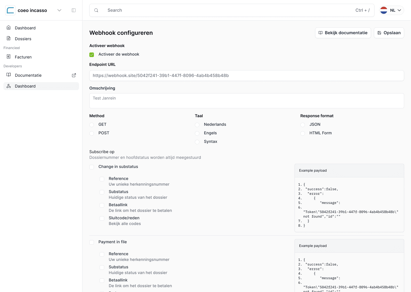
- Self-service file delivery, handling, and updates after onboarding
- A single portal serving integration engineers, accounts receivable handlers, and financial management
Each group worked with the same data, but approached it with different goals, which made balancing those needs central to the design process.
My role
I led the project from kickoff to handoff, translating stakeholder input into sprint-ready goals, running weekly design cycles, and collaborating closely with engineering as they implemented in parallel.
Because design and development moved asynchronously, decisions sometimes had to be revisited, which introduced friction at times, although we established a rhythm that allowed steady progress, with final decisions aligned with the CEO when needed.
My role sat between interface design and systems thinking, where I focused not only on how things looked, but also on how users move from overview to diagnosis to action, and how the system could remain understandable as it grows.
Designing the information model
The core decision was to structure the portal around user intent rather than internal systems or raw data structures, which meant focusing on what users need to understand and what actions they need to take next.
Navigation was shaped by recurring questions identified by sales and IT during client interactions, while common UX patterns such as modals, tables, iconography, and color usage were standardized within a design system, ensuring consistency and making future expansion easier to manage.
From dashboards to decisions
The dashboard was designed to support decision-making rather than act as a collection of charts, providing a clear overview for management, IT, and A/R teams while guiding them toward relevant actions.
Together, these views support a flow from overview to detailed inspection, and then to action, without requiring users to move across multiple tools.
Core flows and interaction patterns
A large part of the project focused on designing repeatable flows that reduce friction in daily operations, especially for A/R teams working with large volumes of data.
These flows were designed as reusable patterns, which allowed engineering to implement them as consistent components rather than isolated solutions.
Designing for multiple user levels
The portal supports users with different levels of expertise, where integration engineers require detailed controls, A/R handlers need efficient workflows for handling volume, and management needs a clear overview without unnecessary detail.
What could come next
We explored additional analytical features in Figma beyond the MVP scope, including geographic case distribution, communication activity trends, and behavioral patterns in portfolio performance, which were not implemented due to resource constraints but remain available for future development.
Technical influence on the build
Design decisions influenced implementation directly, as a repeatable component system allowed the development team to work with reusable building blocks instead of isolated screens, while sprints were structured around user flows rather than individual features.
Management involvement was limited to key decision points, which kept the process focused and reduced unnecessary review cycles, resulting in a more streamlined workflow compared to earlier projects.
Outcome
The portal is currently in a staged rollout, with IT continuing implementation based on the design system, while early feedback is being collected and fed into ongoing iterations.
One early signal is a reduction in basic client questions handled by the sales team, which reflects the initial goal of making information more accessible within the product.
References: coeo